
Now there's a story here, back in 2013 when the Stars were going through their rebrand process they were considering switching to red, white and blue for Texas, Daryl Reaugh was the biggest proponent of this colour scheme and pushed for it till the very end.
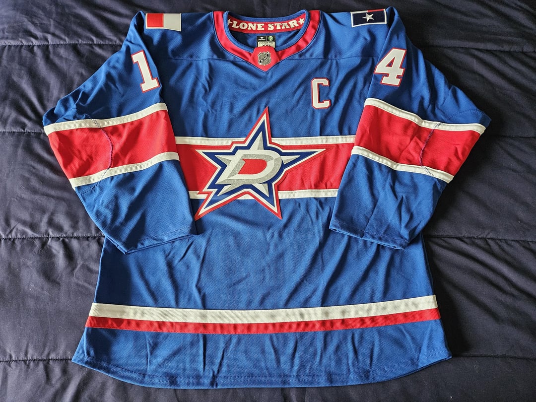
Few weeks ago I was rewatching the rebrand video the Stars put out and noticed this concept they was proposed for the Stars (Picture 8 and 9) and I immediately recognized the stripping pattern of being the Montreal Reverse Retro 1.0 which debuted 8 years after the Stars rebrand. So my mind started working and I first looked for a Montreal RR1 but those are pricey these days but then found this AK blank jersey that I could make into this design.
I was able to get the jersey and get to work slowly over the last number of weeks. I designed the jersey and I decided to treat it as an alternate universe where the Stars did go with this design and are now bringing it into Fanatics (easy since no Dimples) so I designed and embroidered the Fanatics patch and Texas flag shoulder patches. Then wanted to add a hanger effect for the first time on one of my custom jerseys so I gave that a try with a Texas nickname. Got the NHL shield off a Lightning MiC practice jersey and reapplied it to the neck. Designed and applied my own custom size tag version to match the new Authentic Pro tagging coming this year with Fanatics.
This jersey is very weird to see but I love how it came together and how different it is… but thank God Reaugh got out voted on these colours. The Stars are green and they need to stay green!
4 comments
[Dallas Stars Rebrand: The Story Behind Victory Green – YouTube](https://www.youtube.com/watch?v=uuKb2ZAMs-Q)
I would cop a jersey plus matching hat. Great job!
Ps. You should make a matching hat
This looks legit. The details are amazing. Well done OP. But I am glad the Stars stuck with green.
Cool, the Montreal Star Jackets