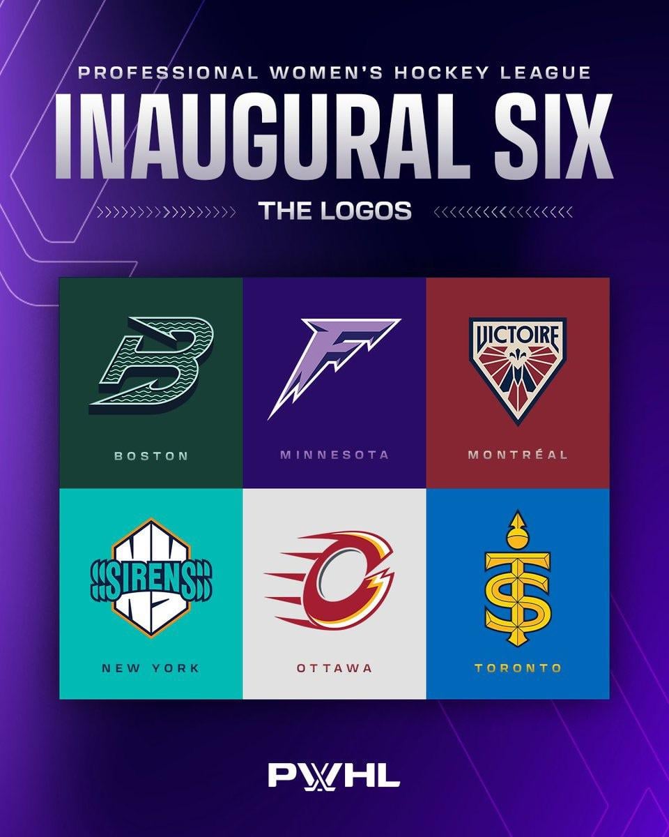
The PWHL have revealed the official new branding of their original 6 teams
September 9, 2024
The PWHL have revealed the official new branding of their original 6 teams
26 comments
Wow that Ottawa one stinks. They took a year to “get it right” and they came up with this?
Montreal’s logo is sick. Minnesota’s logo looks like a junior teams
the dollar store version detroit logo for ottawa is sending me lmfao
Montreal logo is so good
Ottawas looks like a shitty flames concept logo
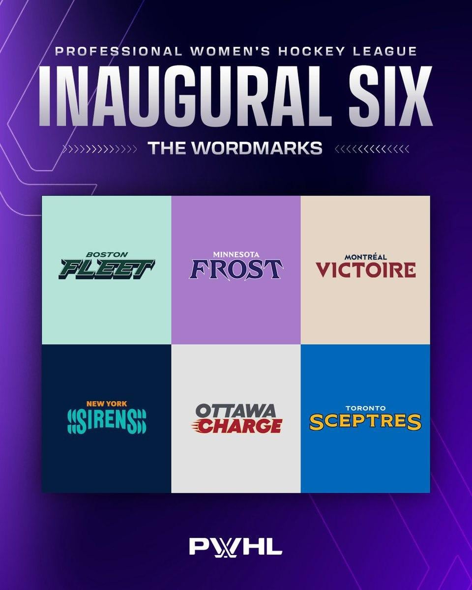
I think Boston has the best name and best logo.
These are honestly **WAY** better than expected. Looking forward to seeing the jerseys.
The Boston logo is great. Frost is better than Superior, but ultimately kind of lame
Toronto logo seemed familiar.
Just look at Toulouse Rugby team logo.
I’m still on the hill the Valkyries was the best name for the Minnesota team. Feminine, but strong, and fits with the Viking theme.
I think a couple others could’ve been better, too.
Montreal is the best. Boston is actually pretty rad though. New York’s first logo is a little messy, but the second logo is good
I fuck with the name Boston Fleet heavy
I’ve always thought the real test of a sport’s team logo is how easy it is for a kid to draw, and on that score none of these get really high marks. Boston, Minnesota and Toronto are the best three.
i don’t hate the NY team name but that logo is terrible
ahh yes, i already see the french headlines in the morning “Une victoire à l’arachée pour le Victoire”
Logo is great, the name is a bit stupid. I really don’t know why they just didn’t keep the “Canadiennes” name.
Boston’s logo is sick
New Yorks name is cool.
Montreal is just good all around.
The rest are just meh.
Anchor/B of Boston looks cool. Ottawa… You tried…?
I like them. More than I thought I would.
Eh. Kinda wack names but whatever
What the hell is a sceptre
Minnesota’s logo reminds of the Fargo Force for some reason. Am I the only one?
I fucking love that the MTL team has a french name that is awkward to say in english, keeping up with our tradition
The logos are all fine, the names I’m not crazy about.
Except Minnesota. That’s gotta go
Montreal’s is fantastic, the rest could have done a little more imo
Alert was so bad and yet somehow they made it worse. Pretty impressive
I’m excited to see the unis! Montreals logo is the best of the bunch, Ottawas looks better as the wordmark

26 comments
Wow that Ottawa one stinks. They took a year to “get it right” and they came up with this?
Montreal’s logo is sick. Minnesota’s logo looks like a junior teams
the dollar store version detroit logo for ottawa is sending me lmfao
Montreal logo is so good
Ottawas looks like a shitty flames concept logo
I think Boston has the best name and best logo.
These are honestly **WAY** better than expected. Looking forward to seeing the jerseys.
The Boston logo is great. Frost is better than Superior, but ultimately kind of lame
Toronto logo seemed familiar.
Just look at Toulouse Rugby team logo.
I’m still on the hill the Valkyries was the best name for the Minnesota team. Feminine, but strong, and fits with the Viking theme.
I think a couple others could’ve been better, too.
Montreal is the best. Boston is actually pretty rad though. New York’s first logo is a little messy, but the second logo is good
I fuck with the name Boston Fleet heavy
I’ve always thought the real test of a sport’s team logo is how easy it is for a kid to draw, and on that score none of these get really high marks. Boston, Minnesota and Toronto are the best three.
i don’t hate the NY team name but that logo is terrible
ahh yes, i already see the french headlines in the morning “Une victoire à l’arachée pour le Victoire”
Logo is great, the name is a bit stupid. I really don’t know why they just didn’t keep the “Canadiennes” name.
Boston’s logo is sick
New Yorks name is cool.
Montreal is just good all around.
The rest are just meh.
Anchor/B of Boston looks cool. Ottawa… You tried…?
I like them. More than I thought I would.
Eh. Kinda wack names but whatever
What the hell is a sceptre
Minnesota’s logo reminds of the Fargo Force for some reason. Am I the only one?
I fucking love that the MTL team has a french name that is awkward to say in english, keeping up with our tradition
The logos are all fine, the names I’m not crazy about.
Except Minnesota. That’s gotta go
Montreal’s is fantastic, the rest could have done a little more imo
Alert was so bad and yet somehow they made it worse. Pretty impressive
I’m excited to see the unis! Montreals logo is the best of the bunch, Ottawas looks better as the wordmark