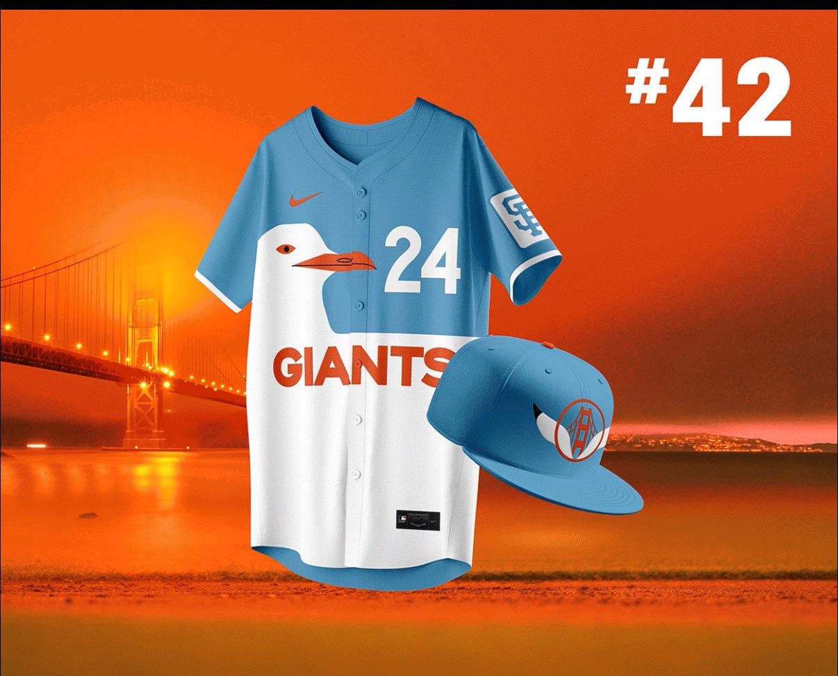
This really isn’t that hard….. this guy has 50+ designs that are better than the ChatGPT generated garbage that Nike released today.
Check out the others here: https://www.behance.net/gallery/209192971/San-Francisco-Giants-Win-Jersey-2024-Series

This really isn’t that hard….. this guy has 50+ designs that are better than the ChatGPT generated garbage that Nike released today.
Check out the others here: https://www.behance.net/gallery/209192971/San-Francisco-Giants-Win-Jersey-2024-Series
23 comments
My only issue is the blue. No blue! Make the blue gray for the fog and this is a no brainer!
That’s the thing I don’t get about the new ones…. They vaguely cite musical references as their inspiration (what is this, Nashville??), but there’s very little about this jersey that’s specific to SF. @fromrohnertpark has several that have obvious references to either San Francisco or the New York Baseball Giants. Things like public transit designs, better versions of the fog, the fuckin seagull. I liked the pinstripe versions too but I could understand them not being flashy enough for City Connect. I’m partial to the one that recreates the old script G. Or even the ones that swap the chest lettering for “the bay” or “the cove”. The 49ers collab was pretty epic though I also see that one never happening.
Name one piece of the new jerseys that can only be identified as part of San Francisco and no other cities.
These jerseys would be way more sick than what they currently have.
Where do we sign the petition? This guy’s creative prowess is beyond brilliant. Deserves way more recognition.
This is actually locally relevant. So that’s a no. 😂
I love how the dumbass old heads in this sub will hate the new connects but will scream and cry over an ugly ass seagull on a jersey lol.
Those things are horrendous. Blue and a big seagull—both of which have nothing to do with the Giants.
I actually hate these jerseys, maybe it’s because there is blue on it. Granted I don’t know what other jersey background would look good either, maybe grey or black, or a sunset orange maybe?
YES!!!
Can’t stand the City Connect idea but I would put this above the others
I don’t like this either. The blue is irritating
And yes of course I get it, it’s the signage. 😐
Y’all know the SF Seals wore blue right? Giants have worn Seals tribute jerseys in the past. No one raised an eyebrow.
But…They’re from Rohnert Park, not SF! 😀 /s
The muni logo one is really really good
Hard no for me dog.
This is so much better, its not even close actually. I would buy the shit out of that, and Ive never bought a giants jersey before.
I love this design
I like the real Citi Connects WAY better than these.
I’ve counted at least 15 that I liked a lot.
The majority of those jerseys are pretty sweet and some are a little iffy. But every one of those hats is a winner
I see the potential.
What I don’t see is the entire uniform.
No. 40 speaks to me as an alternate.
Damn I wish!!