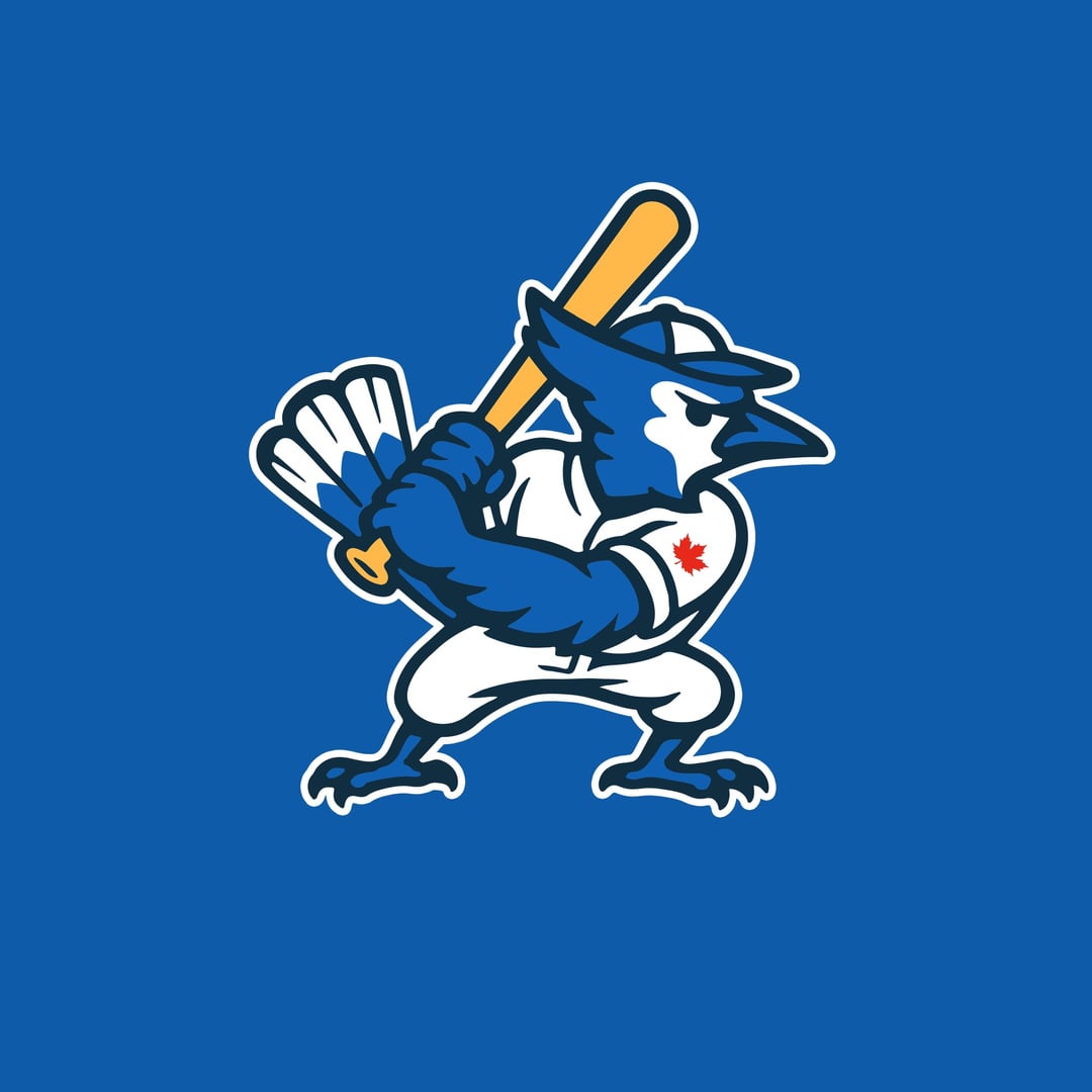
The bird logo is incredible, Id buy that hat in a heartbeat.
The T logo on the other hand…….the leaf looks good lol.
The Jay goes HARD!!!
Is it cool if I use it as a wallpaper?
Great bird logo!
The hat reminds me of the City Connect hat
The T logo looks like some weird drippy dicks
I love the bird logo ! Very cool I’d ruck it for sure
It’s a miss for me, although I could see the Bird logo being a hit on a little league team called the Blue Jays.
Not gonna lie though; the basic skillset is obviously there, it’s just the logo that’s a miss, so keep on cracking at it.
Love the bird logo! Nice job man! (not a fan of the T but like the prominent maple leaf)
The hat is great. Would buy in an instant.
The T reminds me of a pair of legs with a leaf covering the private area lol.
The bird logo is FIRE. I see a little bit of the Raptors logo from it.
The bird is a little too comic for my taste, but it would be a super cool Jr. Jays jersey logo that the players could wear from time to time.
T logo feels disconnected from the team is is more of a City of Toronto logo.
I think the batting bird logo would look good for a minor league affiliate called the “BlueBirds”…well done.
That’s a no for me, but I could not do better so….
AWESOME job, OP! Love the hat, wow!
T is harrdddazz 💯
Looks awesome
Hat is dope!
Make this a real thing I’d buy one 1000%
I like the Jay on the hat, but don’t like it on the jersey
A hat with just the bird head would be sick too. Nice work.
The bird logo is fantastic. Would make a great T-shirt in general, forget the logo.
I like how he keeps his hands back and has the knob pointed towards the catcher. Looks like a pretty good two-strike approach but maybe he should straighten his feet and get a little more balanced.
I love the T logo, but I might straighten out the top cross bar as it is giving it all a bit of a flaccid energy. But I love how you’ve managed to combine the original Blue Jays typography with the nostalgia of a traditional baseball aesthetic. I’d wear that hat for sure.


26 comments
I like it!
Better than ‘night mode’.
The bird logo is incredible, Id buy that hat in a heartbeat.
The T logo on the other hand…….the leaf looks good lol.
The Jay goes HARD!!!
Is it cool if I use it as a wallpaper?
Great bird logo!
The hat reminds me of the City Connect hat
The T logo looks like some weird drippy dicks
I love the bird logo ! Very cool I’d ruck it for sure
It’s a miss for me, although I could see the Bird logo being a hit on a little league team called the Blue Jays.
Not gonna lie though; the basic skillset is obviously there, it’s just the logo that’s a miss, so keep on cracking at it.
Love the bird logo! Nice job man! (not a fan of the T but like the prominent maple leaf)
The hat is great. Would buy in an instant.
The T reminds me of a pair of legs with a leaf covering the private area lol.
The bird logo is FIRE. I see a little bit of the Raptors logo from it.
The bird is a little too comic for my taste, but it would be a super cool Jr. Jays jersey logo that the players could wear from time to time.
T logo feels disconnected from the team is is more of a City of Toronto logo.
I think the batting bird logo would look good for a minor league affiliate called the “BlueBirds”…well done.
That’s a no for me, but I could not do better so….
AWESOME job, OP! Love the hat, wow!
T is harrdddazz 💯
Looks awesome
Hat is dope!
Make this a real thing I’d buy one 1000%
I like the Jay on the hat, but don’t like it on the jersey
A hat with just the bird head would be sick too. Nice work.
The bird logo is fantastic. Would make a great T-shirt in general, forget the logo.
I like how he keeps his hands back and has the knob pointed towards the catcher. Looks like a pretty good two-strike approach but maybe he should straighten his feet and get a little more balanced.
I love the T logo, but I might straighten out the top cross bar as it is giving it all a bit of a flaccid energy. But I love how you’ve managed to combine the original Blue Jays typography with the nostalgia of a traditional baseball aesthetic. I’d wear that hat for sure.
I don’t hate it
These are really good 🙂