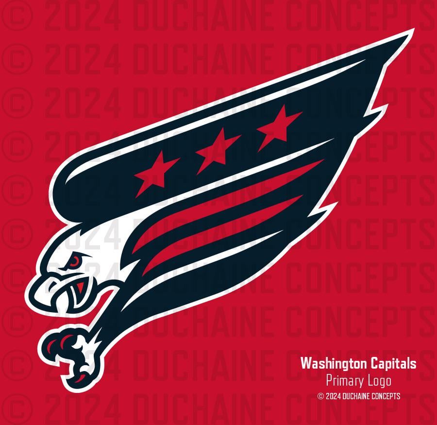
The Screaming Eagle may be the undisputed champ as far as Caps logos are concerned, but I wouldn’t put it back on a sweater full-time without an update. Behold the Modern Screagle.
4 comments
I like ditching the bottom two stars for two lines. Nice nod to the DC flag. But there’s something about this more compact design that just looks weird.
me likey
Mmmmm…. eagle sandwich
I like the red/white/blue much better than the black/aqua/gold uggo ass colors.

4 comments
I like ditching the bottom two stars for two lines. Nice nod to the DC flag. But there’s something about this more compact design that just looks weird.
me likey
Mmmmm…. eagle sandwich
I like the red/white/blue much better than the black/aqua/gold uggo ass colors.