
I purchased these two jerseys around 2011 from a guy that needed cash and claimed he got these from Pat O'Neil, I paid $100 each.
The Orca on the one jersey is blue and the sizes are in inches are two things that stand out to me. Both also have the flighting strap.
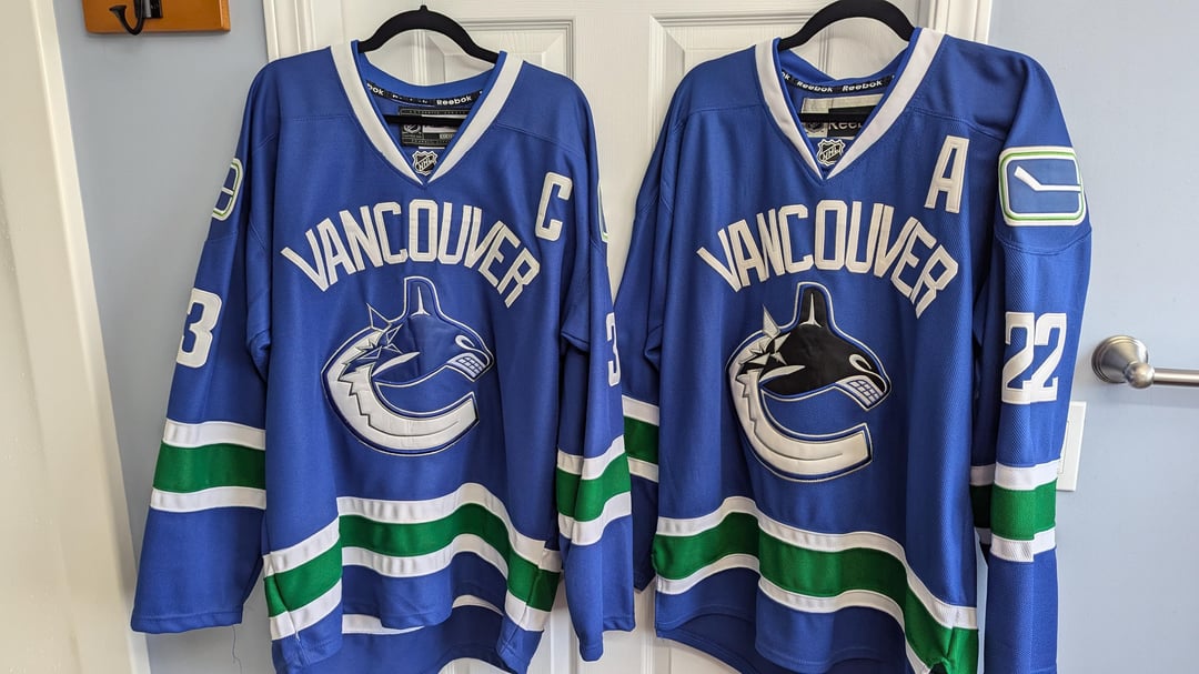
Can anyone tell me if these are authentic?
35 comments
The blue is totally off upon first glace.
I’ve purchased so many jerseys, replica and authentic and id say these are 99.9 percent fake.
Sorry dawg.
The memories you’ve made wearing them over the years are very real though 🙂
💀
Post in /r/hockeyjerseys but they look fake to me, especially given the Reebok AND CCM tags on it. AFAIK, CCM never made the blue orca jersey did they?
One glance at the font for “Vancouver” you can tell these aren’t authentic.
They are both NOT real
Kerning on “Vancouver” is too close together
I’m usually pretty pro buying fake jerseys but these look like shit
Not even close, my cat would even know this.
Colours wrong, font wrong, striping wrong, shoulder patch wrong, logo wrong. Sorry bud, hope you didn’t pay much.
Edit: oof $200 is about $160 more than you should have paid
Dem fat numbers are a dead giveaway
Just looking at them you can tell they take, hopefully you didn’t spend a lot on them
10000% fake. and these are terrible fakes too 😂
Faker than fake.
There’s fake, then there’s really fake, then there’s these.
Fake as my tan.
Totally fake. Colour’s is off, font is off, logo colour is wrong, the stripes are also off.
This has to be a troll post 🤣
I mean this nicely; but these are so obviously fake that if this isn’t a troll post I’m at a loss as to how one couldn’t tell a difference between these and an authentic from any era.
I’m sorry OP, but Gahhhhhhd damn those are fake as hell.
Apart from the Orcas being completely different on both jerseys, the hang tags inside of the collar are both different (the mix match between the post 2011 wordmark logo and the original RBK logo is telltale) the widths of the white stripes are too thick and the green stripes are too thin, the Vancouver font is wrong (letters way too big and the kerning is way too crowded), and the number font is also incredibly wrong (compare the 3’s on this jersey to photos of the jerseys that Henrik wore)
2011 was the peak of fake Canucks jerseys and I’m afraid they all looked terrible compared to the real thing. They stuck out like sore thumbs, especially in crowds.
Fake as Kim K my guy
Those are very fake. Sorry
Both very fake
They are not. Sorry
Not the real deal
Fake AF.
Real question tho, how come fake Canucks Jerseys are so bad?
Fake the colour and the “Vancouver”
Authentic, i think these are MiC actually
100% fake, sorry bud
Got them from pat o’Neil the Canucks equipment manager, yeah I’m not too sure about that boss
Lmao, “got them from Pat O’Neill” thats a good one
You got ripped off if you paid $100 for these fakes. The color and font aren’t even close
Immediately no
These fake cuts were absolutely everywhere I’m 2011 and I kind of dig how bad they are. They are almost iconic now, 13 years later.
They represent a specific era in this city. Everybody wore them. Everybody wanted to be a part of something special. Seeing older generations wear them with pride, knowing they scored a “deal off a guy who got them from Pat O’Neil” actually makes me smile, now.
Not even good fakes dude, fuckin wear em anyways. I’d say you got your 200 bucks worth. Now learn what fakes look like.