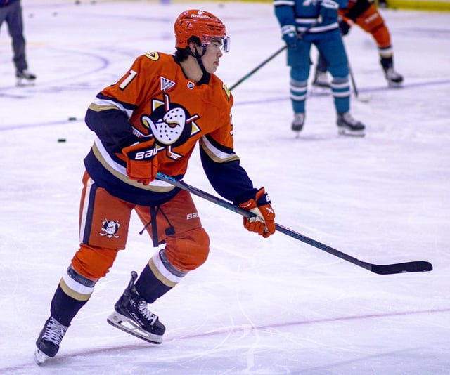
Idk why but it feels very busy to me. Almost seems like a European league kit to me for some reason.
This is really ugly. So busy, looks like a European jersey. And way too heavy on the orange.
Could do without the shoulder patches
Orange, yellow and gold. Hmm.
They look awful lol. Too bad cause the logo’s great
I like the jersey, just don’t think I like it with the orange pants.
Well…I definitely don’t like that.
Tbh not a fan of orange much but this works. Obviously still prefer the original colors but they seem hellbent on pushing the orange.
Looks like a giant beat up traffic cone.
It’s like ANA tries to overcomplicate their lives
Groas
Black/eggplant pants and maybe helmet and this would be a mean look
Idk I kind of like it
A bit chaotic with how busy it is but I like the logo and the choice to go mostly monochromatic orange with blue sleeves/gloves. Don’t love this one over all, but I do love teams that take big swings
Who the fuck thought orange pants with these were a good idea
Best uniform in the league, imo
Absolutely fantastic logo and colours
Perfect stripes
It’s amazing
I like the color, but it needs black pants. Too much orange.
I feel like black pants and helmet could have been a better choice
I love the logo! So happy they brought the logo back
I dig it. The logo on the pants shell seems a little big though.
Eggplant when
Fugly af
I like em. Unpopular opinion, I know.
Yeah we know, we’ve seen it, it’s trash, let’s move on
More stripes then a Zebra on that fucking thing, yuck
If they just get rid of the shoulder patches it would be top tier. Makes everything look a bit crowded with those on, otherwise I like them
Ducks really need to get away from the orange
To this day the shittiest team name ever 😳 ! Ducks. wtf ? Squirrels woulda been better even. Waddling goddamn DUCKS 😂
Still one of the worst kits in the league. Just horrible.
That is SO much better!!!
Look great. Nice to see some color
Logo still goes hard!
Need more orange to be identifiable
I really like them
Idk how they made this bad
This is unfortunate. Too much orange. The jersey would be fine with dark bottoms and a black helmet. Also the epaulets need to go.
I agree with others that the pants and helmet should be black, but I still like it overall. I just fucking love the color orange.


36 comments
Idk why but it feels very busy to me. Almost seems like a European league kit to me for some reason.
This is really ugly. So busy, looks like a European jersey. And way too heavy on the orange.
Could do without the shoulder patches
Orange, yellow and gold. Hmm.
They look awful lol. Too bad cause the logo’s great
I like the jersey, just don’t think I like it with the orange pants.
Well…I definitely don’t like that.
Tbh not a fan of orange much but this works. Obviously still prefer the original colors but they seem hellbent on pushing the orange.
Looks like a giant beat up traffic cone.
It’s like ANA tries to overcomplicate their lives
Groas
Black/eggplant pants and maybe helmet and this would be a mean look
Idk I kind of like it
A bit chaotic with how busy it is but I like the logo and the choice to go mostly monochromatic orange with blue sleeves/gloves. Don’t love this one over all, but I do love teams that take big swings
Who the fuck thought orange pants with these were a good idea
Best uniform in the league, imo
Absolutely fantastic logo and colours
Perfect stripes
It’s amazing
I like the color, but it needs black pants. Too much orange.
I feel like black pants and helmet could have been a better choice
I love the logo! So happy they brought the logo back
I dig it. The logo on the pants shell seems a little big though.
Eggplant when
Fugly af
I like em. Unpopular opinion, I know.
Yeah we know, we’ve seen it, it’s trash, let’s move on
More stripes then a Zebra on that fucking thing, yuck
If they just get rid of the shoulder patches it would be top tier. Makes everything look a bit crowded with those on, otherwise I like them
Ducks really need to get away from the orange
To this day the shittiest team name ever 😳 ! Ducks. wtf ? Squirrels woulda been better even. Waddling goddamn DUCKS 😂
Still one of the worst kits in the league. Just horrible.
That is SO much better!!!
Look great. Nice to see some color
Logo still goes hard!
Need more orange to be identifiable
I really like them
Idk how they made this bad
This is unfortunate. Too much orange. The jersey would be fine with dark bottoms and a black helmet. Also the epaulets need to go.
I agree with others that the pants and helmet should be black, but I still like it overall. I just fucking love the color orange.