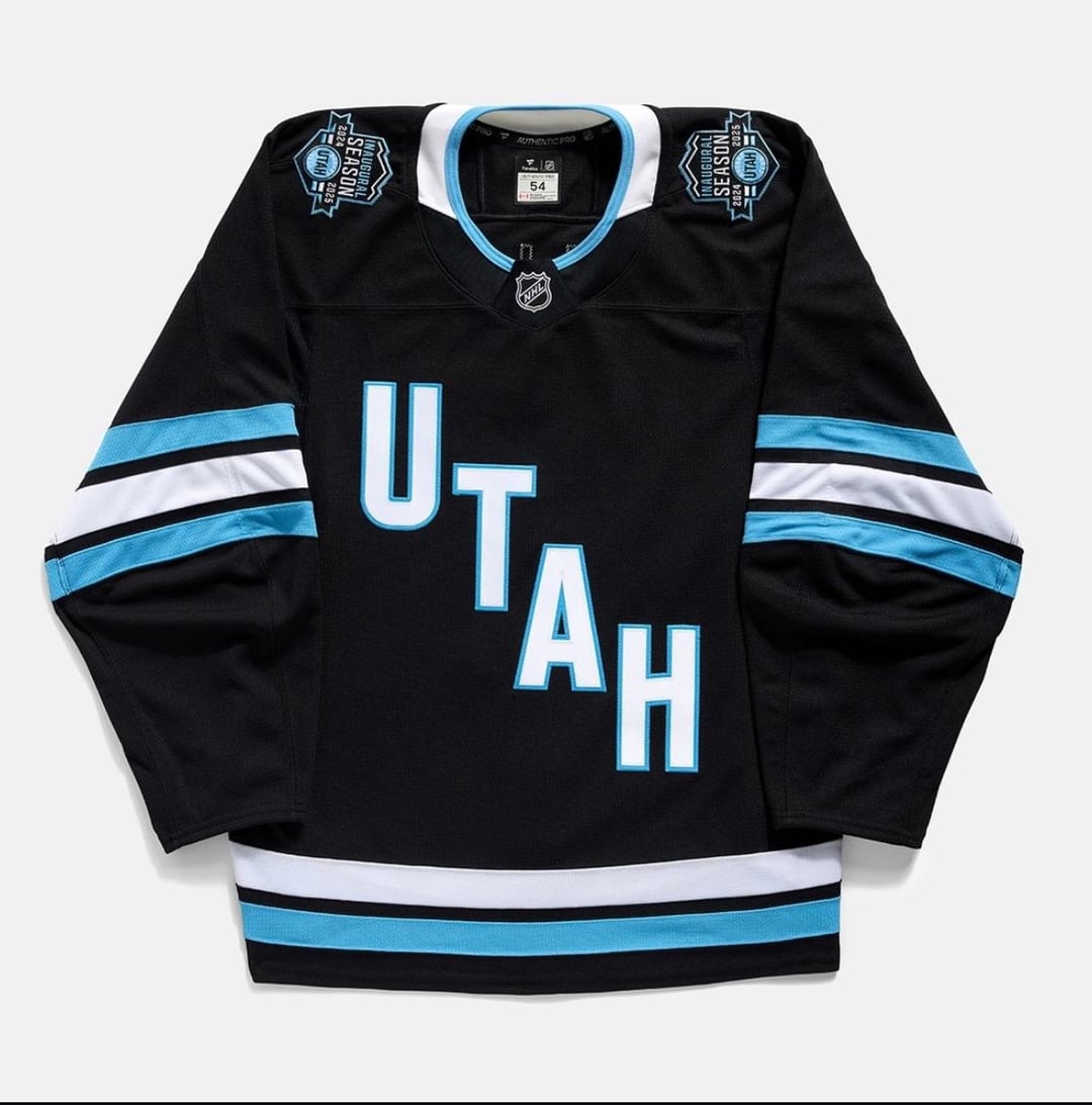
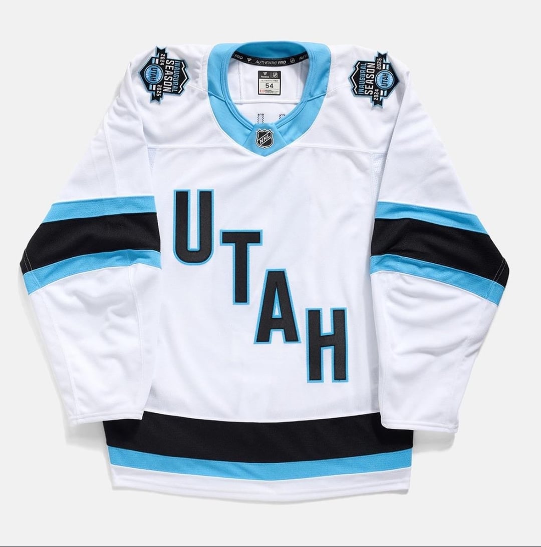
First Look at Utah HC’s Homes, Aways, and Inaugural Season Patches
September 9, 2024
First Look at Utah HC’s Homes, Aways, and Inaugural Season Patches
27 comments
Pics via UtahHockeyClub on IG
i like the aways, the homes should have used the blue as the base color
Meh its like when you create a team in the nhl games and skip over the bulk of the uniform section
This is like the 5th or 6th first look I’ve seen in the last two months
😂 so bad
Is Fanatics doing bingo wings like the old Koho’s? Cuz if so that blows ass
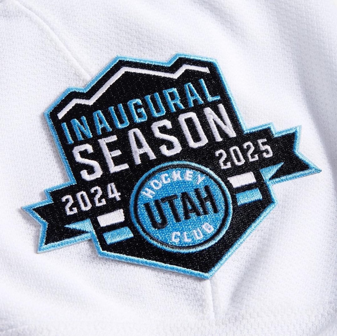
Very funny move to go with two inaugural season parches bc of lack of any logos including secondary logos.
Consider myself whelmed
Two inaugural patches is laughable, but it sure as hell beats an ad.
Have there been any reports on the colour scheme being final or is that also part of the branding process in addition to the name/logo?
I like the baby blue but in their current executions the jerseys look like Jets and Kraken, respectively
They will need to improve if they ever want an r/hockey flair
You have to applaud the Ducks for being bold with their uniforms, even if you disagree with the look.
I feel like new jerseys opinions on the internet are like the super bowl haft time show. Expectations are way higher than they need to be, strong feelings are had and in 2 weeks nobody is going to give a shit. Every so often somebody nails it but most are perfectly fine.
I am still surprised that when Utah went to the nhl with a plan for having a team, they didn’t have to have a team nickname picked out beforehand so this wouldn’t happen. I know it all came about quicker than expected but still think it’s a missed opportunity to not be solidified with a name on day one
I need them to switch to their primary color being that blue. Its so pretty and having it as a secondary to the black is such a sad development.
Bonus points for not having an ad but overall nothing spectacular.
It seems like they should’ve gotten this stuff like team names and stuff done earlier
I don’t mind these at all. Colours are sharp and the jerseys are classic. Still better than half the teams…looking at you Duck a l’Orange!
The waist stripes not matching is certainly a choice
Still can’t believe they’re gonna play with pwhl jerseys
I love how UHC was such a shitty, slapshod, so clearly under-the-table graft that they didn’t even bother to arrange a team nickname in time for their inaugural season.
While I know that it isn’t the same blue, I’m kind of glad another team came in and claimed the black and blue combo. Seeing as Tampa has squandered it by using their very uninspired leaf replicas.
How uninspiring the uniforms are. Can you make it look more generic?
I wished they used a more unique color for the team, seems like more than half the teams in league have a blue or black color scheme.
Honestly this just seems like a cash grab. Sell these the first year, sell new ones the next year, use these as “retro” style later. Pass

27 comments
Pics via UtahHockeyClub on IG
i like the aways, the homes should have used the blue as the base color
Meh its like when you create a team in the nhl games and skip over the bulk of the uniform section
This is like the 5th or 6th first look I’ve seen in the last two months
😂 so bad
Is Fanatics doing bingo wings like the old Koho’s? Cuz if so that blows ass
Very funny move to go with two inaugural season parches bc of lack of any logos including secondary logos.
Consider myself whelmed
Two inaugural patches is laughable, but it sure as hell beats an ad.
Have there been any reports on the colour scheme being final or is that also part of the branding process in addition to the name/logo?
I like the baby blue but in their current executions the jerseys look like Jets and Kraken, respectively
They will need to improve if they ever want an r/hockey flair
You have to applaud the Ducks for being bold with their uniforms, even if you disagree with the look.
I feel like new jerseys opinions on the internet are like the super bowl haft time show. Expectations are way higher than they need to be, strong feelings are had and in 2 weeks nobody is going to give a shit. Every so often somebody nails it but most are perfectly fine.
I am still surprised that when Utah went to the nhl with a plan for having a team, they didn’t have to have a team nickname picked out beforehand so this wouldn’t happen. I know it all came about quicker than expected but still think it’s a missed opportunity to not be solidified with a name on day one
I need them to switch to their primary color being that blue. Its so pretty and having it as a secondary to the black is such a sad development.
Bonus points for not having an ad but overall nothing spectacular.
It seems like they should’ve gotten this stuff like team names and stuff done earlier
I don’t mind these at all. Colours are sharp and the jerseys are classic. Still better than half the teams…looking at you Duck a l’Orange!
https://preview.redd.it/6rbjrq5kvtnd1.jpeg?width=1569&format=pjpg&auto=webp&s=d75004856b2380784f240a0c7f53ce1868e7cef4
These aren’t that bad
When bro is indecisive
The waist stripes not matching is certainly a choice
Still can’t believe they’re gonna play with pwhl jerseys
I love how UHC was such a shitty, slapshod, so clearly under-the-table graft that they didn’t even bother to arrange a team nickname in time for their inaugural season.
While I know that it isn’t the same blue, I’m kind of glad another team came in and claimed the black and blue combo. Seeing as Tampa has squandered it by using their very uninspired leaf replicas.
How uninspiring the uniforms are. Can you make it look more generic?
I wished they used a more unique color for the team, seems like more than half the teams in league have a blue or black color scheme.
Honestly this just seems like a cash grab. Sell these the first year, sell new ones the next year, use these as “retro” style later. Pass