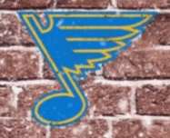
Couldn't quite place what was different between the two winter classic crests so decided to stack em. The new note is from the original rollout teaser graphic.
You talk about a company with little tweaks to their logo over the years, I don't know if any of them have more notches in the bedpost than our little beauty of a note.

6 comments
The blues logo is probably one of the best in all of sports. Absolutely classic and insanely unique
Something about the shorter wings looks so nice to me. Makes me feel faster.
IT’S FLYING!!!
And I thank ye
Seriously, that logo’s like the chameleon of sports brandingg.
Hah yea that’s awesome. I saw the same thing in the Google form/poll images. At first I thought they were the same but then I noticed the differences in the top notch and the thickness of the yellow lines on the interior of the wing.